
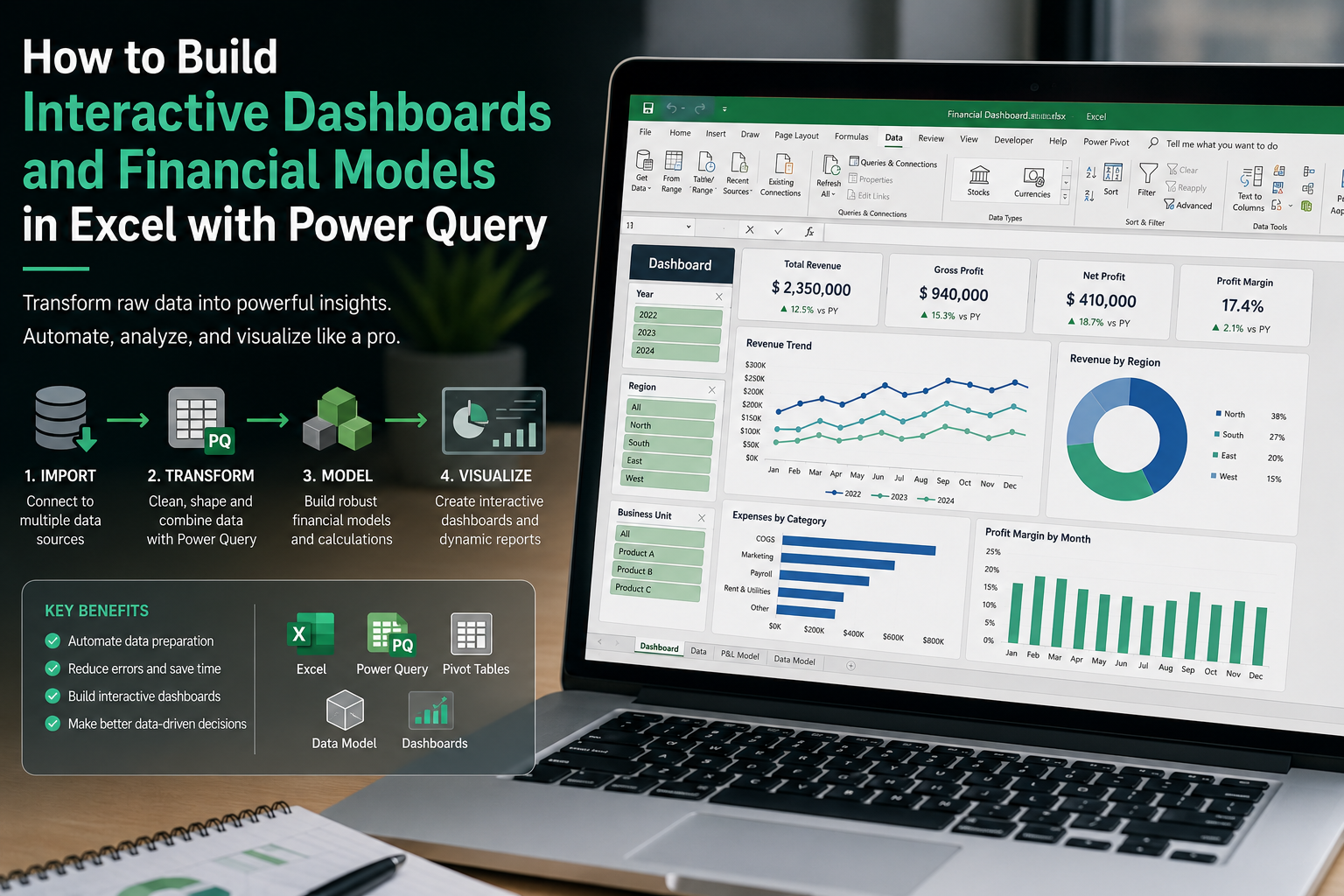
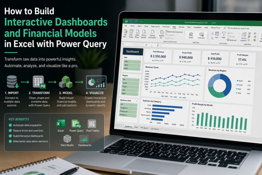
In the modern corporate and analytical landscape, the ability to transform millions of rows of raw data into actionable business intelligence is an indispensable technical competency. Although numerous cloud-native platforms exist for data visualization, the combination of advanced Microsoft Excel, Power Pivot, and Power Query remains the underlying engine for the vast majority of financial analysis and operations departments globally.
This article details, from an objective and technical perspective, how to structure the architecture of an automated interactive dashboard. We will explore everything from the data extraction (ETL) phase to user interface design, ensuring the model is scalable, auditable, and highly efficient.
1. The ETL Architecture: Extract, Transform, and Load
The most destructive architectural error when building a control panel is dumping information directly onto the visible spreadsheet (the presentation layer). For a dashboard to be robust and handle the ingestion of new data without crashing, data processing must occur in an isolated background environment: the Power Query engine.
The Extract Phase
Automated extraction eliminates human error derived from manual copying and pasting. Through the Data > Get Data tab, Excel allows you to establish direct connections with various sources:
- Corporate SQL databases or ERP systems.
- CSV or TXT files hosted in local folders or the cloud (SharePoint / OneDrive).
- Web platform APIs or macroeconomic data repositories.
By connecting directly to the source, the dashboard ceases to be a static document and becomes a dynamic data-reading application.
The Transform Phase
Upon entering the Power Query editor, the «M» formula language is used to clean the information. This is the critical phase of modeling. Strict rules must be applied here:
- Date and Data Type Normalization: Ensuring monetary values are recognized as currency and not text. When structuring complex financial models, temporal precision in Power Query calculations is non-negotiable. For instance, in accounting calculations or asset provision adjustments, if financial logic dictates that a change takes effect at the end of year 2, the data model must be formulated so that, automatically on January 1st of year 3 (or the corresponding calendar year), those changes are already accounted for in the projected financial statements and panel visualizations.
- Error Debugging: Elimination of null values, empty rows, or special characters that could corrupt calculation formulas.
- Merge Queries: Similar to a VLOOKUP or a JOIN in SQL, this allows cross-referencing a campaign’s cost table with the CRM’s conversion database using a unique identifier.
The Load Phase
Once transformed, data should not be loaded into a traditional spreadsheet, but into Excel’s internal Data Model (Power Pivot). This compresses the information and allows the management of millions of records without degrading the file’s performance, enabling the use of advanced analytical functions.
2. Analytical Modeling and DAX Language
With the information housed in the relational model, the next step is building the business’s mathematical logic. This is where we transcend simple column summation to enter predictive analysis and performance tracking.
Instead of creating calculated columns that bloat the file size, the technical best practice is to use Measures written in DAX (Data Analysis Expressions) language. Measures are virtual formulas that are only calculated at the exact moment they are visualized on the dashboard, saving computational memory.
Some examples of essential analytical expressions include:
- Time Intelligence: DAX formulas like
SAMEPERIODLASTYEARallow for the automatic calculation of Year-over-Year (YoY) revenue growth without the need to manually align dates. - Dynamic Financial Ratios: Creating measures that divide total revenue by the count of new customers to obtain the Average Ticket, which adjusts instantly when the user filters by country or quarter.
3. Visual Architecture and User Interface (UI) Design
The presentation layer is what the end-user interacts with. A good interface design should reduce cognitive load and guide the eye toward critical metrics.
Excel Design Principles
- Blank Canvas: The first step is to turn off gridlines (View > Gridlines). This transforms the appearance of a standard spreadsheet into an App Canvas.
- Z-Pattern Visual Hierarchy: The human eye in Western cultures scans from left to right and top to bottom. The top-left corner should house the dashboard title; the top row should be dedicated to macroeconomic or global performance «KPI Cards» (Total Sales, Customer Acquisition Cost, Gross Margin).
- Rigorous Chart Selection:
- Line Charts: Exclusive for showing trends over time.
- Horizontal Bar Charts: Ideal for creating top-down rankings, such as performance by city or best-selling product.
- Avoid Pie Charts: Technical literature on data visualization warns that the human brain struggles to compare angles accurately; it is preferable to use donut charts or bar charts for market share distribution.
4. Interactivity and Unattended Updates
The difference between a static report and a professional dashboard is interactivity. By using Slicers and Timelines, visual buttons are created that the user can press to filter the entire panel.
By linking a single slicer (e.g., «Geographical Zone») to all the hidden pivot tables feeding the charts, pressing one button mathematically updates the entire interface in milliseconds.
Finally, maintenance automation is absolute. At month-end, the analyst simply replaces the source file and clicks Refresh All. Power Query will repeat the extraction, execute the cleaning code, feed the relational model, and refresh the charts without writing a single new line of code.
Analyst’s Perspective: Share Your Experience
When working with extensive data models in Power Query, what has been the most complex performance hurdle you have had to resolve? Optimizing load times during massive database merges, or managing date hierarchies in multi-year financial models? Debating optimization methodologies is fundamental; leave your impressions in the comments.
5. Frequently Asked Questions (FAQ) about Power Query and Excel
What is the actual data limit a dashboard in Excel can handle? A standard spreadsheet has a physical limit of 1,048,576 rows. However, by loading information directly into the internal Data Model (Power Pivot) via Power Query, Excel utilizes the xVelocity engine (the same as Power BI), which compresses data and can fluidly process tens of millions of records, depending solely on the computer’s RAM.
Can Machine Learning algorithms or predictions be connected to Excel? Yes. Through native integration with Python and R, or by consuming Azure Machine Learning services via Power Query, it is possible to import columns containing time-series forecasts, NLP customer categorization, or automated credit risk assessments directly into the dashboard.
Is it safe to share these types of corporate scorecards? If the file contains sensitive transactional data, security best practices recommend hosting the data model in the cloud (such as Power BI Service or an SQL server) and using Excel strictly as the visualization layer (connected via Analysis Services). This ensures that end-users cannot access the source code or extract the raw databases.