In the modern enterprise, data is generated at an unprecedented velocity. However, raw data in its native format is largely incomprehensible to the average business user. Historically, organizations relied on static spreadsheets and rigid reporting structures to make sense of this information. Today, the landscape of Business Intelligence (BI) is undergoing a radical transformation. Next-gen data visualization is no longer just about creating visually appealing charts; it is about leveraging Artificial Intelligence (AI), real-time streaming, and interactive architectures to democratize data across the entire organization.
This comprehensive guide explores the defining characteristics, core technologies, and leading platforms shaping the next generation of data visualization. Whether you are analyzing financial models, operational bottlenecks, or organizational structures, understanding these trends is critical for maintaining a competitive edge.
1. The Paradigm Shift: From Static Dashboards to Dynamic Liveboards
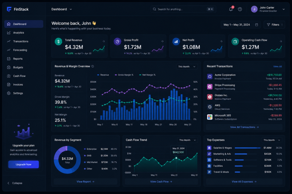
For over a decade, the standard for data reporting was the static dashboard. These dashboards were typically built by data engineers, updated on a periodic basis (weekly or monthly), and presented data in fixed formats like basic tables and charts. While they offered a snapshot of historical performance, they severely limited an organization’s ability to react to immediate market changes.
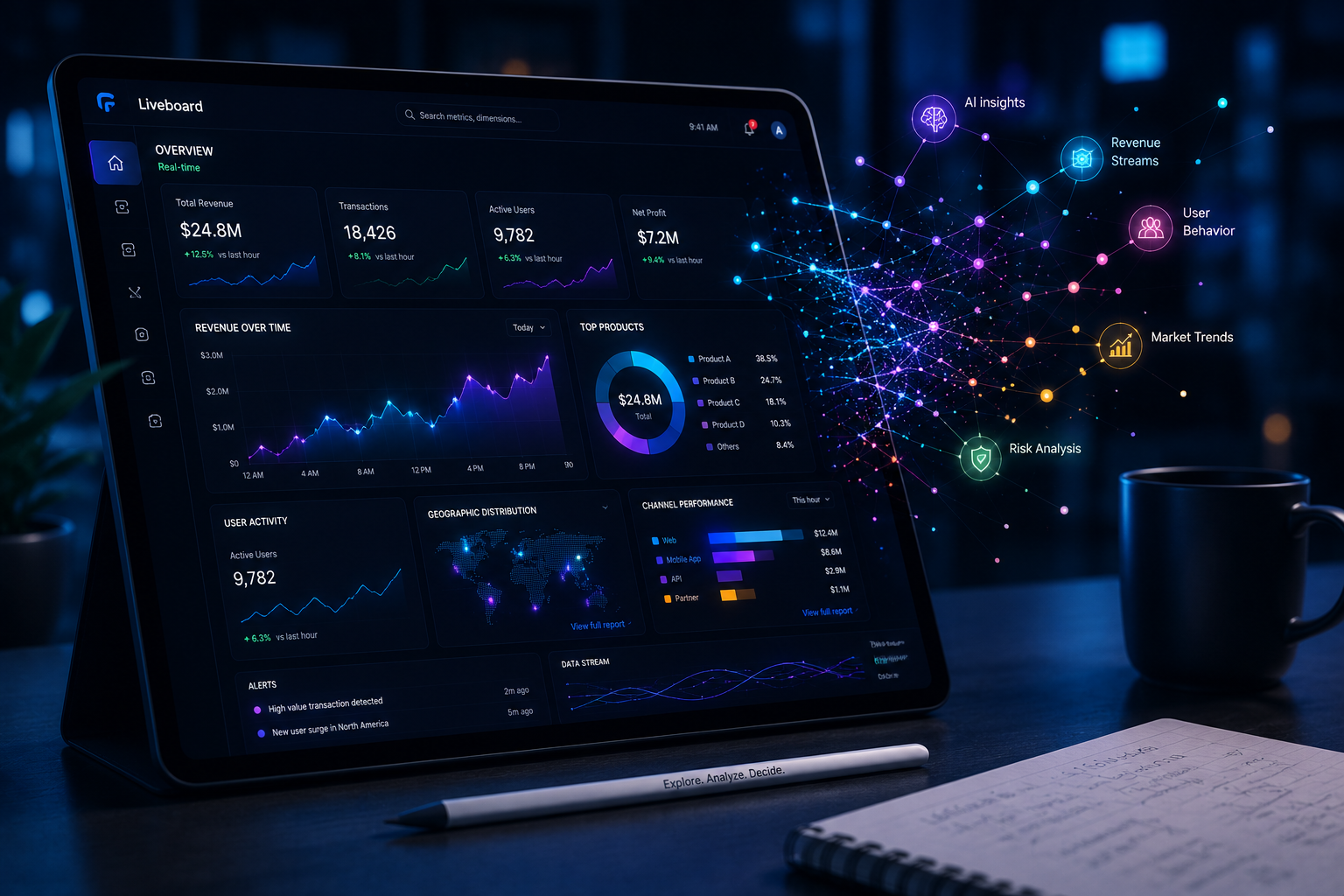
Next-gen data visualization fundamentally shifts this dynamic. Modern platforms are replacing static views with interactive «Liveboards».
- Real-Time Data Access: Having timely access to data is crucial for effective decision-making in fast-paced environments.
- Continuous Updates: Unlike legacy dashboards that rely on periodic updates, modern interactive Liveboards provide real-time data updates, ensuring access to the most current information.
- Immediate Industry Impact: This real-time capability is particularly vital in industries like finance and healthcare, where conditions can shift in mere minutes and require immediate responses.
By utilizing advanced data visualization techniques, complex information is transformed into intuitive charts, graphs, and interactive maps that allow users to understand relationships and trends intuitively.
2. AI-First Interactions and Natural Language Processing (NLP)
Perhaps the most significant leap in next-gen data visualization is the integration of Generative AI and Natural Language Processing (NLP). The traditional analytics workflow was heavily fragmented: data engineers built models, analysts created dashboards, and business users waited for reports.
Today, the evolution of BI centers on AI-first interactions, where users can ask questions directly to AI agents to access insights.
- Conversational Analytics: Users can interact with business data much like conducting an everyday web search or chatting with a virtual assistant.
- Instant Visual Generation: By asking a question like «Why did conversions drop last month?», users can receive instant answers accompanied by supporting visualizations.
- Agentic Workflows: Platforms are introducing specialized AI agents that handle repetitive tasks. For example, ThoughtSpot features «Spotter» agents that can build governed semantic models in minutes, assemble complete Liveboards from a single prompt, and even generate embedded analytics code in seconds.
This shift drastically reduces the bottleneck typically found in IT departments, allowing non-technical business users to query complex datasets independently.
3. Visualizing the Workforce: Organizational and HR Analytics
When discussing data visualization, the focus often defaults to financial metrics or customer acquisition costs. However, a highly specialized and vital sector of next-gen visualization is organizational performance and HR analytics. As organizations evolve into hybrid systems of people and AI, data becomes the central driver of performance.
Platforms like Ingentis (org.manager) demonstrate how visualization can be applied to workforce dynamics.
- AI-Ready Foundations: These platforms harmonize HR data by integrating with leading systems like SAP, Workday, and Oracle to create a unified, reliable, and AI-ready data foundation.
- Interactive Org Charts: They replace static employee lists with interactive org charts and real-time dashboards that bring key workforce data to life.
- Strategic Simulation: Beyond simple visualization, these tools allow organizations to simulate different structural scenarios, assess their impact early, and reduce risk before implementing changes like reorganizations or mergers and acquisitions.
By combining visualization, analytics, and simulation, businesses can actively design their organizations to be efficient, data-driven, and future-proof.
4. Embedded Experiences: Analytics in the Daily Workflow
A major friction point in traditional BI is context-switching. Forcing a sales representative to leave their Customer Relationship Management (CRM) software to log into a separate analytics portal kills momentum. Next-gen data visualization solves this through embedded analytics.
The future of BI dictates that analytics will live natively inside daily platforms, not in separate ones.
- Seamless Integration: Organizations are moving analytics directly into the applications where decisions happen, including CRMs, customer portals, and operational platforms.
- Contextual Intelligence: This means sales reps can view pipeline intelligence directly within Salesforce, or support teams can see customer health metrics inside Zendesk.
- Code-Free Deployment: Modern tools allow developers to integrate fully interactive, AI-driven analytics into existing applications in just a few days.
When data visualizations are embedded directly into the natural workflow, user adoption rates skyrocket, and organizations see a much higher return on their data investments.
5. Interactive Exploration and Collaborative Analytics
The ability to interact with data is critical for uncovering deeper insights that might be missed in static views. Next-gen visualization heavily emphasizes interactive data exploration.
- Dynamic Elements: Modern Liveboards incorporate features such as drill-downs, filters, and tooltips.
- Drill Anywhere: Advanced platforms allow users to drill into the granular details of their data from any angle without needing pre-defined drill paths constructed by an engineer.
Furthermore, the 2026 workplace demands real-time collaboration. Collaborative BI platforms now feature shared workspaces where multiple stakeholders can analyze the same live data, annotate insights, and reach consensus together. This eliminates the friction of version control chaos and endless email threads, ensuring that finance, sales, and marketing teams are all aligned on a single, governed data source.
6. Mobile-First BI: Decision Making on the Go
In a world defined by hybrid work and distributed teams, mobile-friendly dashboards are no longer a luxury; they are a competitive requirement. Many legacy dashboards lack mobile optimization, limiting access to important information when users are away from their desks.
Next-gen data visualization embraces a mobile-first approach. Mobile BI has evolved to become a primary interface for decision-making, delivering full conversational analytics optimized for smartphones and tablets. Decision-makers can utilize voice queries during commutes, check metrics between meetings, and instantly share insights via team messaging platforms.
7. Reviewing the Top Next-Gen Data Visualization Tools
The software market offers a variety of powerful tools, each catering to specific organizational needs. Based on recent comprehensive industry reviews, here is a breakdown of the leading platforms:
- Microsoft Power BI: Considered one of the strongest all-rounders, it integrates seamlessly with Microsoft 365, Teams, and Azure. The addition of the Copilot feature allows users to ask natural language questions (e.g., «show me revenue trends») and receive instant, well-designed visualizations.
- Tableau: Setting the standard for visual excellence, Tableau is favored by professionals who require pixel-perfect dashboards and powerful storytelling capabilities. Features like Ask Data and Explain Data provide intelligent suggestions and deeper insights into charts.
- ThoughtSpot: Leading the search-driven analytics space, ThoughtSpot revolutionized exploration by letting users interact with data using natural language. Its AI agents (SpotIQ and Spotter) automatically detect anomalies and generate narrative summaries, making it ideal for democratizing data access.
- Looker: A Google Cloud company, Looker is highly regarded for its strong semantic modeling layer, ensuring that everyone in the enterprise uses the same metrics and definitions. Powered by Gemini capabilities, it excels in embedded analytics and large enterprise deployments where governance is critical.
- Domo & Zoho Analytics: Domo acts as a unified, all-in-one solution that brings data from thousands of apps into intelligent dashboards, featuring AI Chat and Magic Transform tools. Meanwhile, Zoho Analytics offers a compelling value proposition for SMBs, providing powerful AI-driven insights on a tighter budget.
8. Best Practices for Implementing Next-Gen Visualizations
Transitioning to next-gen visualization requires more than just purchasing new software. To maximize the value of these tools, organizations should adhere to several best practices:
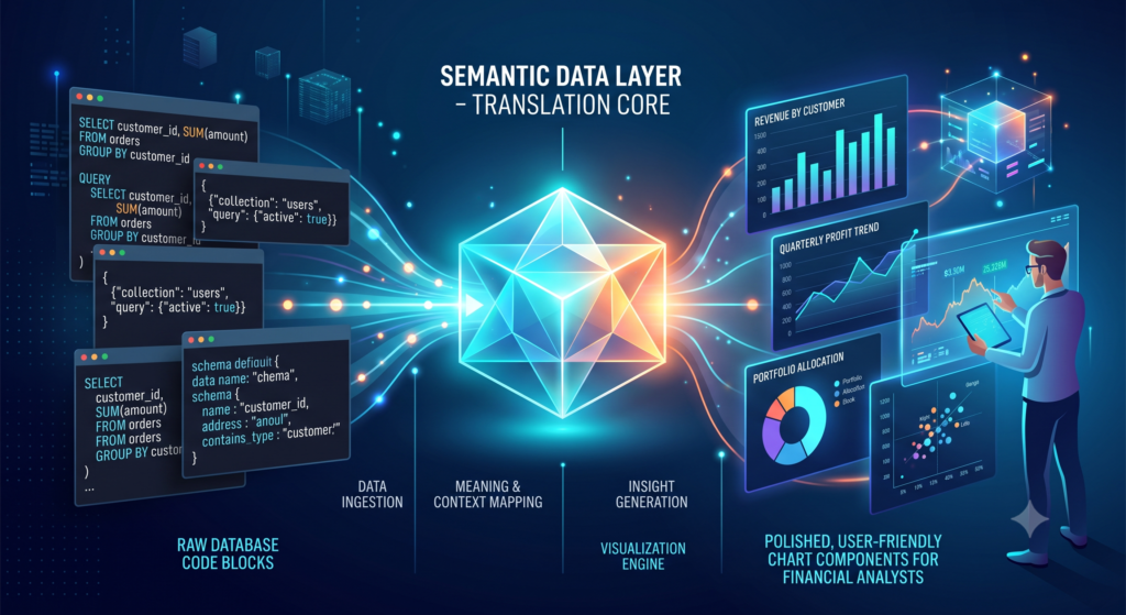
- Prioritize Data Governance: Before deploying AI-driven search tools, ensure you have a robust semantic layer. If the underlying data is messy or poorly defined, AI will simply generate visualized inaccuracies at a faster rate.
- Focus on Data Literacy: While natural language search makes querying easier, employees still need to know what questions to ask. Invest in training that helps teams understand basic statistical concepts and business logic.
- Start Small with Embedded Analytics: Instead of overhauling your entire BI infrastructure overnight, start by embedding a few highly relevant visualizations into the CRM or operational tool your team uses most frequently.
- Embrace Iteration: Data visualization is an ongoing process. As business objectives change, the dashboards and Liveboards should evolve alongside them.
Frequently Asked Questions (FAQ)
What is the difference between a traditional dashboard and a next-gen data visualization tool?
Traditional dashboards are generally static, require manual updates, and limit users to pre-defined drill paths. Next-gen visualization tools are highly interactive, update in real-time, allow for natural language querying, and utilize AI to automatically detect anomalies and generate insights.
How does a semantic layer improve data visualization?
A semantic layer translates complex, raw database code into familiar business terms (like «Gross Revenue» or «Active Users»). This ensures that when different users ask an AI tool for a specific metric, the system uses a single, governed definition, preventing conflicting data reports across departments.
Is my company’s data safe when using AI-driven visualization tools?
Enterprise-grade BI platforms are built with strict data governance, role-based access control (RBAC), and security protocols. When implementing these tools, it is crucial to ensure that the AI models do not use your proprietary data to train public models. Always review the vendor’s data processing and privacy agreements.
🗣️ Interactive Perspective: Over to You!
As organizations transition from static spreadsheets to AI-powered Liveboards, the way we interact with data is changing daily. What is the biggest hurdle your team faces when trying to make sense of complex data? Is it the technical challenge of integrating multiple data sources, or is it getting non-technical team members comfortable with using new BI tools? Share your thoughts and experiences in the comments below!