In the modern financial ecosystem, the sheer volume of data generated every millisecond is staggering. From global equities and decentralized digital assets to corporate earnings reports and macroeconomic indicators, market participants are drowning in numbers. However, raw data on a spreadsheet holds no intrinsic value until it is translated into a format that the human brain can quickly process, analyze, and act upon.
This is where the science and art of Financial Visualizations become indispensable.
Financial visualization is the practice of mapping complex quantitative data into graphical representations. It bridges the gap between deep mathematical computation and intuitive business intelligence. Whether you are a retail investor scanning the S&P 500, a corporate CFO analyzing quarterly cash flows, or a quantitative researcher building algorithmic models, the way you visualize your data directly dictates the quality of your decisions. This comprehensive guide explores the evolution of financial charts, breaks down the core visualization types used by industry leaders, and outlines the best practices for building robust, data-driven financial narratives.
The Evolution of Financial Data Representation
Historically, financial data was consumed sequentially. In the early 20th century, ticker tape machines printed stock prices one by one on a continuous strip of paper. Traders had to mentally map these sequential numbers to identify trends. The transition to static line charts and bar charts offered a massive leap forward, allowing analysts to see historical contexts at a glance.
Today, the landscape is defined by dynamic, highly interactive data environments. Modern platforms have pushed the boundaries of what is possible. Websites like Finviz have popularized the use of dense, macro-level heatmaps that allow users to digest the performance of thousands of equities in a single glance. On the programmatic side, environments like the Wolfram Language enable data scientists to generate highly complex, mathematically rigorous financial models on the fly. Concurrently, data storytelling platforms like Flourish emphasize the aesthetic and narrative power of financial data, making it accessible to non-technical stakeholders in boardrooms and media publications.
The modern financial visualization is no longer just a chart; it is an interactive workspace.
Core Types of Financial Visualizations (and When to Use Them)
Selecting the right chart is critical. The wrong visualization can obscure vital trends or, worse, mislead the viewer. Financial visualizations generally fall into three distinct categories: Time-Series Analysis, Market Overview, and Corporate Finance Flow.
1. Time-Series Analysis: Tracking Price Action
Time-series charts are the bedrock of market analysis, displaying how an asset’s price behaves over a specified period.
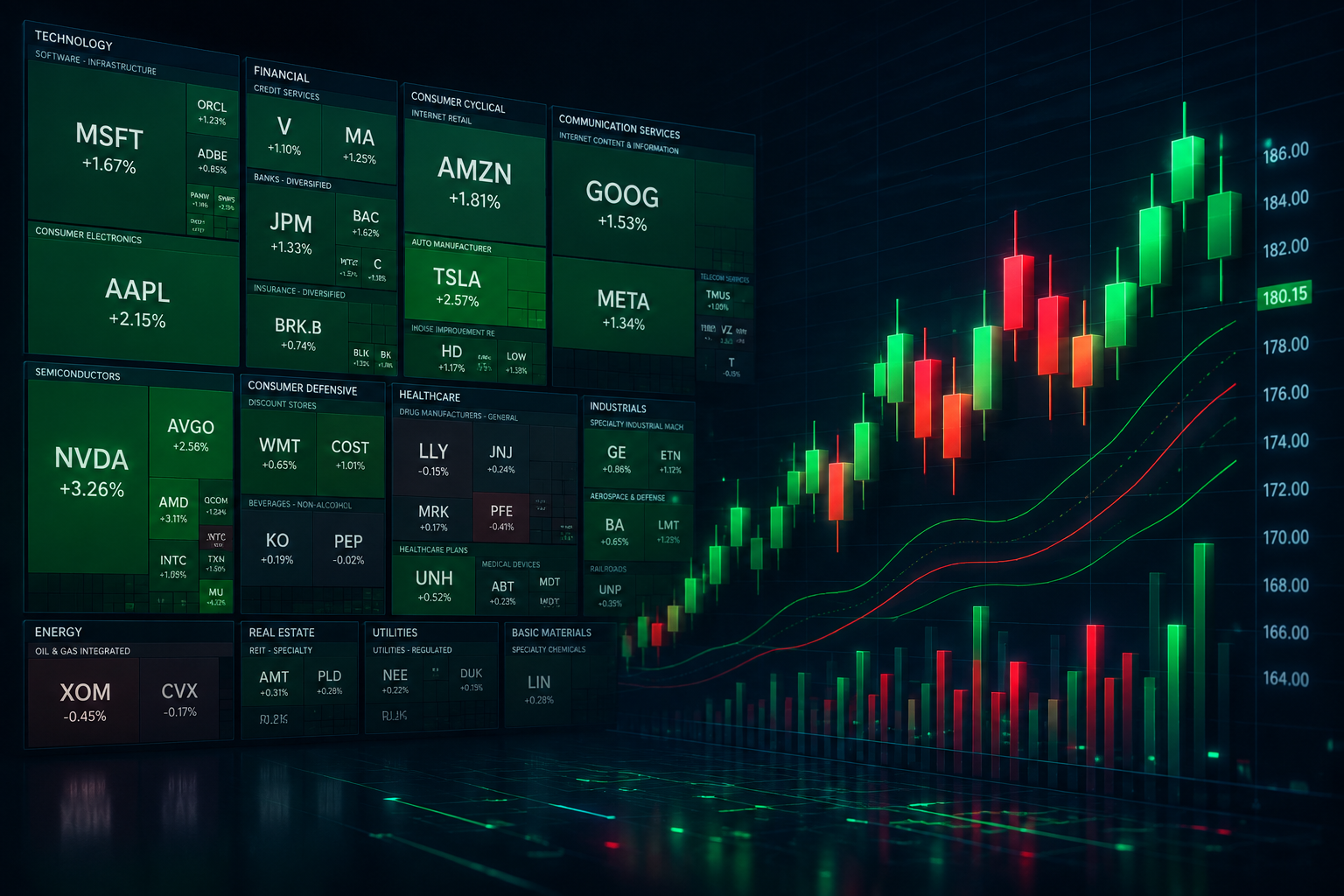
- The Candlestick Chart: Originating in 18th-century Japan for tracking rice prices, the candlestick chart remains the undisputed standard for traders. Unlike a simple line chart that only shows the closing price, a single candlestick displays the Open, High, Low, and Close (OHLC) for a specific timeframe. The «body» indicates the difference between open and close, while the «wicks» show the extreme highs and lows. This density of information allows analysts to immediately gauge market psychology—whether buyers or sellers are in control.
- Noise-Reduction Charts (Renko, Kagi, Point & Figure): Traditional time-series charts are heavily influenced by the passage of time. However, advanced quantitative environments often utilize charts that disregard time entirely, focusing purely on price movement. For example, a Renko chart only prints a new «brick» when the price moves by a predefined amount. If the price remains flat for weeks, the chart does not move. This filters out market «noise» and highlights true support, resistance, and macro trends.
2. Market Overview: Visualizing the Macro Environment
When an analyst needs to understand the health of an entire sector or index, individual asset charts are insufficient.
- Treemaps (The Market Heatmap): A treemap represents hierarchical data as a set of nested rectangles. In finance, this is most famously used to visualize stock market indices. The size of the rectangle represents the company’s market capitalization, and the color (typically ranging from bright green to deep red) represents the daily percentage change. This allows a viewer to instantly see if the tech sector is driving the market up while the energy sector is lagging, processing thousands of data points in a fraction of a second.
- Scatter Plots for Risk/Reward: When evaluating a portfolio of assets, a scatter plot is invaluable. By plotting expected return on the Y-axis and historical volatility (risk) on the X-axis, analysts can visually identify the «efficient frontier»—finding assets that offer the highest potential return for the lowest mathematical risk.
3. Corporate Finance and Cash Flow
Beyond trading, financial visualizations are critical for internal corporate accounting and FP&A (Financial Planning and Analysis) teams.
- Sankey Diagrams: A Sankey diagram is a flow visualization where the width of the arrows is proportional to the flow quantity. It is the ultimate tool for visualizing a corporate budget or a country’s GDP. A CFO can use a Sankey diagram to show exactly how gross revenue (one massive block on the left) splits into operating expenses, taxes, R&D, and ultimately, net profit on the right.
- Waterfall Charts: Standard bar charts struggle to explain why a metric changed over time. A waterfall chart solves this by showing the cumulative effect of sequentially introduced positive and negative values. For example, it perfectly illustrates how a company started with $10 million in Q1, lost $2 million in operations, gained $4 million in investments, and ended with $12 million in Q2.
The Principles of Effective Data Storytelling in Finance
Having access to advanced charting tools is only half the battle. Presenting that data effectively requires an understanding of cognitive load and data storytelling.
1. Maximize the Data-to-Ink Ratio Pioneered by data visualization expert Edward Tufte, the data-to-ink ratio dictates that every pixel on a screen should serve a purpose. In financial dashboards, this means stripping away 3D effects, unnecessary gridlines, heavy borders, and decorative backgrounds. If an element does not convey quantitative information, it is a distraction and should be removed.
2. Leverage Color Psychology Carefully In finance, color carries inherent semantic meaning. Green universally signals positive growth, profit, or bullish movement, while red indicates loss, deficit, or bearish action. Straying from these conventions confuses the user. However, when designing for broader audiences, it is also crucial to consider color blindness. Many modern financial BI tools offer red/blue or color-blind-safe palettes to ensure accessibility without sacrificing clarity.
3. Interactive vs. Static Deliverables The context of the visualization dictates its format. If you are building a dashboard for a live trading desk, interactivity is mandatory. Users must be able to zoom in on specific timeframes, toggle technical overlays (like moving averages or Bollinger Bands), and hover over data points for exact values. Conversely, if the visualization is destined for a printed quarterly shareholder report, it must be completely self-sufficient. A static chart must include clear legends, annotated peaks or troughs, and a definitive title that explains the chart’s core message.
Tools of the Trade: Finding the Right Visualization Stack
The market offers a wide array of tools tailored to different levels of technical expertise and specific financial use cases.
- Retail Screeners and Web Dashboards: Platforms designed for rapid, out-of-the-box market analysis (such as Finviz) are ideal for investors who need instant macro overviews. They require zero coding knowledge and offer pre-configured heatmaps, screener filters, and technical charts.
- Business Intelligence (BI) and Storytelling Platforms: For corporate finance, FP&A teams, and financial journalists, tools like Tableau, PowerBI, and Flourish are standard. They allow users to connect massive internal databases (like an ERP system) and build highly aesthetic, interactive dashboards, Sankey diagrams, and waterfall charts using drag-and-drop interfaces.
- Programmatic and Quantitative Environments: For institutional quants, risk managers, and algorithmic developers, point-and-click tools are insufficient. They rely on programmatic environments like Python (using libraries like Matplotlib, Plotly, or Seaborn), R, and the Wolfram Language. These environments allow for the manipulation of massive datasets, the generation of specialized charts (like interactive 3D volatility surfaces), and the integration of live API data feeds into proprietary models.
Best Practices for Designing Financial Dashboards
If you are tasked with building a financial dashboard for your organization or personal portfolio, adherence to strict design principles will elevate your product from a confusing spreadsheet to a powerful analytical engine.
- Establish a Visual Hierarchy: The most critical KPIs (Key Performance Indicators)—such as Total Portfolio Value, Net Margin, or Daily P&L—should be displayed as large, bold numbers at the top left of the dashboard. Supporting charts should flow downward, with the most granular data (like individual transaction logs) situated at the bottom.
- Provide Context: A number in isolation is useless. If a dashboard shows a quarterly revenue of $5 million, the viewer immediately asks, «Is that good or bad?» Always provide context via historical comparisons (Year-over-Year or Quarter-over-Quarter growth percentages) or visual benchmarks against a target goal.
- Design for Mobile-First Consumption: In today’s on-the-go environment, executives and investors frequently check financial data on their smartphones. Complex, dense dashboards will break on a small screen. Ensure your visualizations are responsive, automatically collapsing into vertically stacked cards and simplifying tooltips for touch interfaces.
Join the Conversation: What’s Your Visualization Stack?
The way we interpret financial data is deeply personal and highly dependent on our specific roles within the market.
Are you a visual trader who relies heavily on complex candlestick patterns and technical indicators, or do you prefer the clean, macro-level overview of a market heatmap? If you work in corporate finance, have you transitioned your team from static spreadsheets to interactive storytelling dashboards?
Drop a comment below and share the visualization tools and chart types you rely on daily. What is the one data visualization feature you wish your current platform had? Your insights help our tech community discover better ways to analyze the markets!
Frequently Asked Questions (FAQ) About Financial Visualizations
What is the best type of chart for day trading? For short-term trading, the Candlestick chart is universally preferred. It provides the highest density of price action data per timeframe, allowing traders to read market momentum, reversals, and volatility far more effectively than a standard line chart.
How do market heatmaps (treemaps) actually work? A market heatmap groups assets (usually stocks) by sector and sizes them based on their market capitalization (total market value). The color indicates the asset’s performance over a specific period. A large, bright green square means a massive company is performing very well, while a tiny red square means a small company is losing value. This allows users to digest the performance of an entire index in seconds.
Do I need to know how to code to create advanced financial visualizations? No. While quantitative researchers use programming languages like Python or Wolfram to build bespoke models, modern Business Intelligence tools and online financial screeners offer powerful, drag-and-drop interfaces that allow anyone to build professional-grade interactive charts without writing a single line of code.
Why are Sankey diagrams recommended for budgets? Sankey diagrams excel at showing the «flow» of money. Instead of looking at isolated pie charts, a Sankey diagram visually connects the source of the funds (e.g., Sales, Investments) to exactly where those funds are allocated (e.g., Payroll, Marketing, Profit). The thickness of the visual flow instantly communicates where the majority of capital is being directed.